

结 Jié
Instructor Jenny Kowalski
Project Branding - 结 Jié
Institution Tyler School of Art and Architecture
Software Illustrator, Photoshop, indesign, 3D stager
This is a branding project for a restaurant names 结 Jié. Jié means knotting in Chinese. Traditional hand-woven crafts use knotting for luck. We serve traditional Beijing food to share traditional Chinese culture in America and remind Chinese immigrants of home.

This is the logo for this restaurant. This logo contains the Chinese character and Chinese pinyin. I combined “结” and “jié” to better express the central element of the restaurant: knot. (The logo has simplified versions for smaller sizes.)

Logo Process

I put our pattern on the font of business card, and uses “结” and “jié” and some Chinese knot design on the back. It can be combined to form a complete Chinese knot if you combine two business cards.


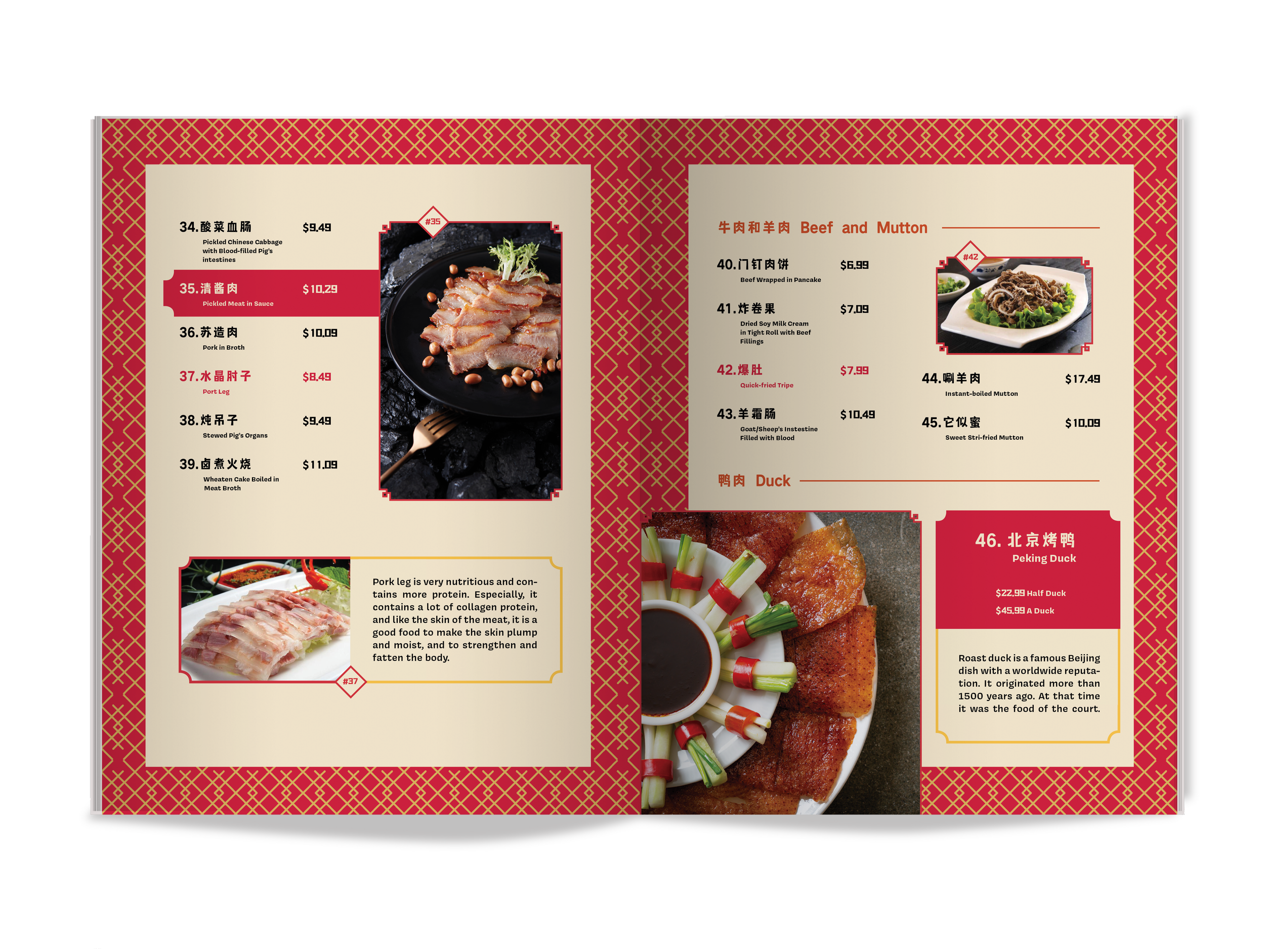

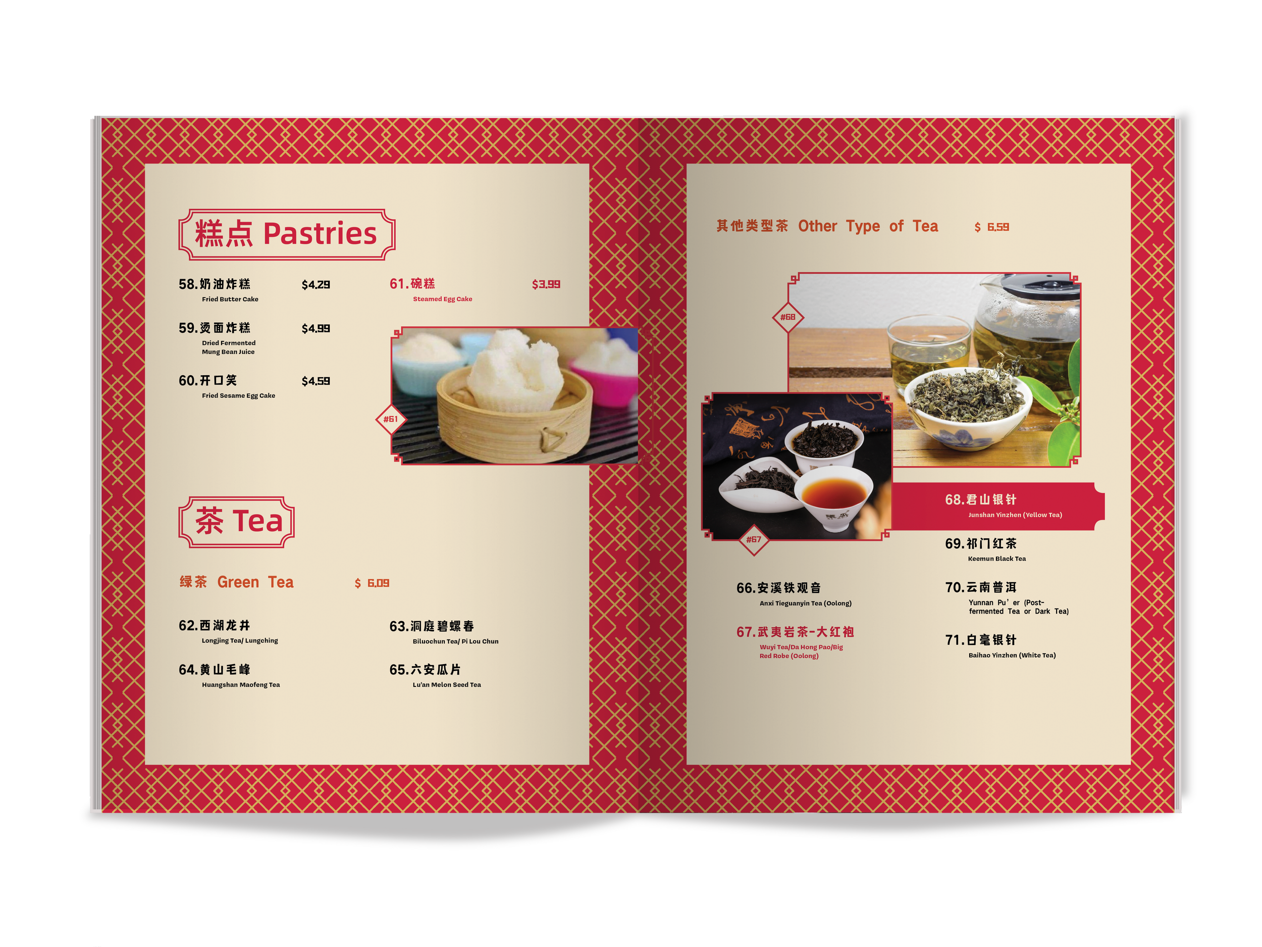

These pictures show the design of the interior of the menu. The names of the dishes in red are some of the chef’s recommended dishes. The names of the dishes inside the red box are connected to the pictures. There are also some very popular dishes with text descriptions.


In addition to the essential logo, business cards, and menu, I also designed some supporting elements for the restaurant. For example, chopsticks, plates, bags and teacups. Masks are also important for safety. All these designs use the pattern of the restaurant and the Chinese knot elements. This restaurant has its own Instagram to share some of our designs and some of our dishes.